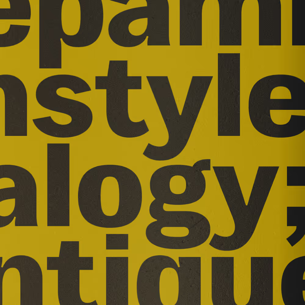
UT Clarke is a Grotesque typeface that balances functional clarity with subtle warmth. It references the dependable backbone of early 20th-century sans-serifs, with a particular nod to Franklin Gothic, but pares them back and rebalances familiar forms for contemporary use.
While Clarke retains the genre’s rational proportions and industrial tone, its softened detailing sets it apart. Rounded terminals, open apertures, and flattened curves contribute to a voice that feels confident without being overbearing. Horizontal joins on letters like ‘n’ and ‘m’ create a sense of structure, while characters like ‘g’ and ‘a’ introduce a humanist edge within a consistent system.
Available as a static family of 16 styles and as three variable fonts across weight and slant axes.
Secure checkout via Shopify. Prefer to pay by invoice or bank transfer? Get in touch.


UT Clarke is a Grotesque typeface that balances functional clarity with subtle warmth. It references the dependable backbone of early 20th-century sans-serifs, with a particular nod to Franklin Gothic, but pares them back and rebalances familiar forms for contemporary use.
While Clarke retains the genre’s rational proportions and industrial tone, its softened detailing sets it apart. Rounded terminals, open apertures, and flattened curves contribute to a voice that feels confident without being overbearing. Horizontal joins on letters like ‘n’ and ‘m’ create a sense of structure, while characters like ‘g’ and ‘a’ introduce a humanist edge within a consistent system.
Available as a static family of 16 styles and as three variable fonts across weight and slant axes.